Unleashing Creativity: Elevate Your Space with Bold Wall Designs

Stephanie Kratz • May 6, 2024

Walls serve as blank canvases waiting to be adorned with creativity and personality. One trend that has been making waves in the design world is the bold use of wall prints to transform mundane walls into captivating focal points. Whether you prefer vibrant patterns, subtle textures, or eye-catching graphics, embracing bold wall prints can breathe new life into your space and infuse it with character and charm. Let's explore the art of being bold with wall prints and how you can elevate your interiors with statement walls that speak volumes.


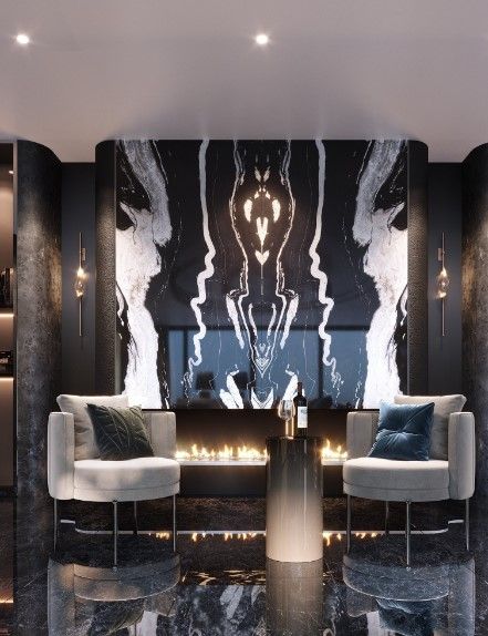
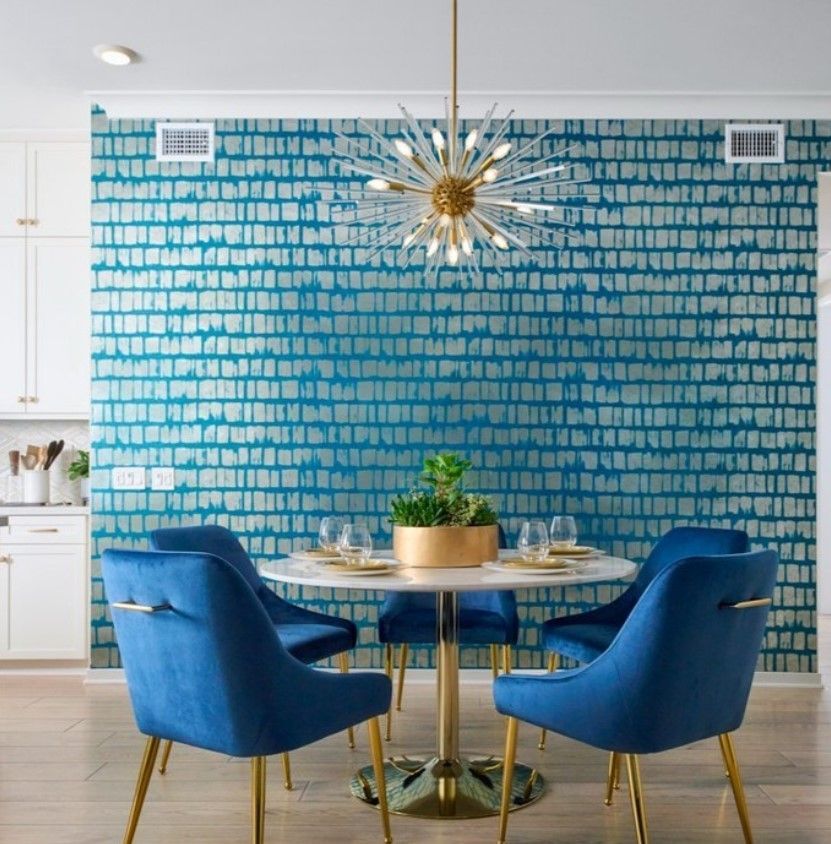
Incorporating textured wall prints is another way to add depth and dimension to your space while making a bold statement. Textured wallpapers, 3D wall panels, and fabric wall coverings can introduce tactile richness and visual interest to your walls, creating a multi-dimensional look that enlivens the room. Experiment with metallic finishes, embossed patterns, and tactile surfaces to add a touch of luxury and sophistication to your space. Mixing different textures and finishes can create a dynamic interplay of light and shadow, adding depth and complexity to your walls.


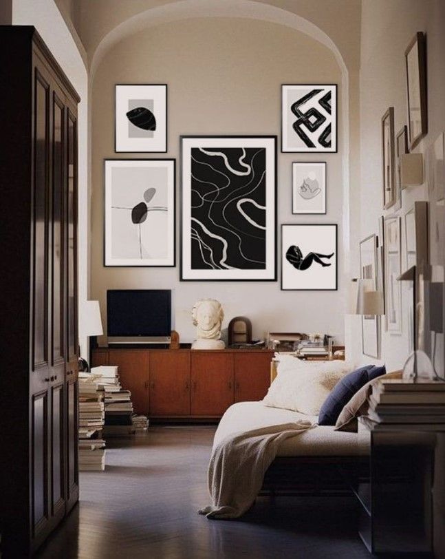
Bold wall prints offer a unique opportunity to infuse your space with personality and style. Whether you prefer a minimalist aesthetic with subtle graphic prints or a maximalist approach with vibrant patterns and colors, your choice of wall prints can reflect your taste, preferences, and design sensibilities. Consider selecting prints that resonate with you on a personal level, whether they evoke a sense of nostalgia, inspire creativity, or simply bring joy to your space. By curating a collection of wall prints that speak to your soul, you can create a space that feels truly authentic and reflective of who you are.


Boldness in design choices allows for personal expression and the transformation of spaces into reflections of style and personality. By daring to be bold with wall prints and art, you can infuse your space with charm, personality, and visual interest, turning it into a dynamic canvas that mirrors your unique taste and creativity.

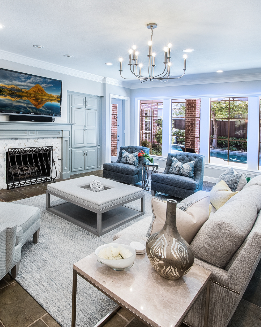
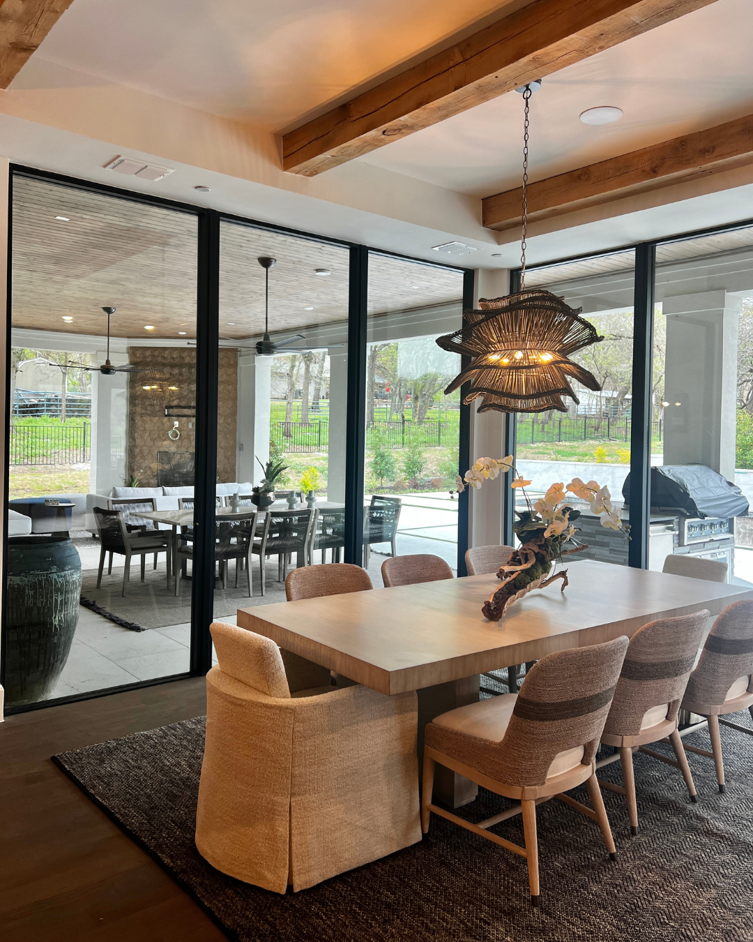
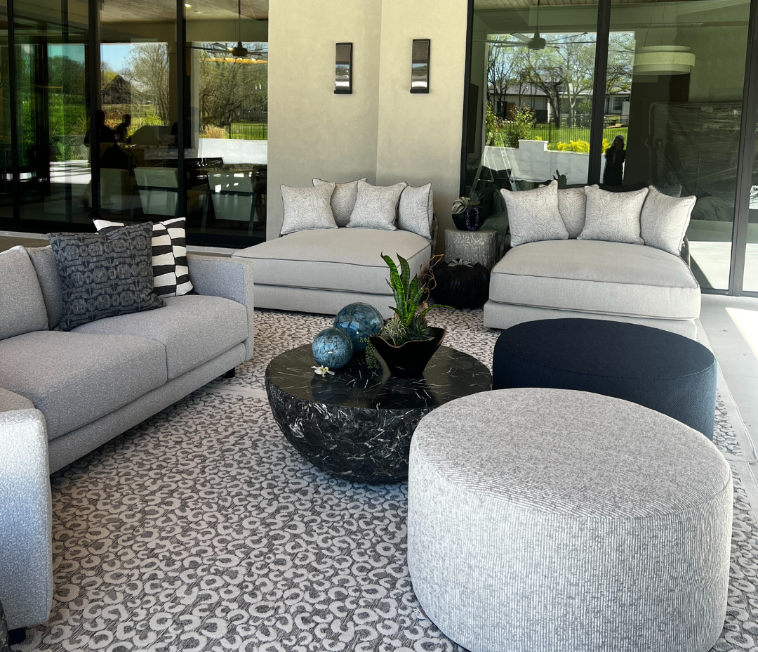
Design/image credit to @artdesignph, @lux.interiors, @tripointehomes, @stephaniekratzinteriors

  • Slide title

    Write your caption here
    Button
  • Slide title

    Write your caption here
    Button
  • Slide title

    Write your caption here
    Button
  • Slide title

    Write your caption here
    Button

Share This Post

By Stephanie Kratz March 11, 2026
Estimated Read Time: 4 minutes Key Takeaways :  Use your rug as a "visual island." Keeping furniture legs on the rug prevents a "floating" look and ties the whole room together. Small rugs shrink a room. Choose a large rug that reaches near the walls to instantly expand the space and feel more luxury. Mix textures like plush wool against smooth wood. This "high-touch" contrast adds depth you can actually feel.
By Stephanie Kratz March 4, 2026
Estimated Read Time: 3-4 minutes Key Takeaways: Size Up: Use inserts that are 2 inches larger than the pillow cover for a plush, high-end look. Layer Scales: Combine large squares, medium squares, and lumbars for visual interest. Texture Over Pattern: Focus on mixing materials (velvet, linen, wool) to create sophisticated depth. The "Chop": Use feather-down fills to allow for the classic designer "V" chop at the top. A Designer’s Guide to Styling Throw Pillows When we think about making a house look really nice throw pillows are very important. They are not something you add to a room they actually make the room look complete. Throw pillows are like the touches that make a house feel like a home. They add texture and color to a room, which's really important. You have to be careful because if you add too many throw pillows to a sofa it can start to look messy. You want your sofa to look comfortable and inviting not like it is too full of pillows. Throw pillows can make a difference, in how a room looks so you have to use them in the right way. At Stephanie Kratz Interiors we think about pillows, in a way. We want to make sure they look good together and are the size. Each pillow should do something for the room. It should help tell the story of the room. We call this the rooms narrative. At Stephanie Kratz Interiors we consider the composition and scale of pillow styling. 5 Strategies for Professional Pillow Styling Master the "Rule of Three" for Scale This means you have to use sizes. We usually start with a pillow, like a 22" or 24" one and it is a solid color or has a subtle texture. We put this pillow at the back. Then we add a 20" pillow with a pattern in front of the one. After that we add a 18" pillow to finish it off. This way of layering the pillows makes things look deeper and more interesting. If you just use pillows that're all the same size it does not look as nice as the "Rule of Three" for Scale. The "Rule of Three" for Scale is really good, for making things look sophisticated. Prioritize High-Quality Inserts We always make sure to use quality down or feather inserts. These inserts are always a little bigger than the cover. For example if the cover is 20 inches we use a 22 inch insert. This way the pillow looks nice and full. It also keeps its shape. Feels really soft and nice. This is much better than a pillow that feels flat or fake. We want our pillows to have a luxury look and feel and using high quality inserts like down or feathers is the key. High quality inserts, like these make all the difference. Mix Textures, Not Just Colors When you are decorating a room, with one color it can still be really interesting if you mix different textures. For example you can put a thick blanket made of heavy yarn with a smooth shiny velvet that feels nice to touch. You can combine a cool and crisp linen fabric with a soft and flexible leather. The idea is to mix textures that are all the same color so your room feels fancy and expensive without being too flashy. This is what people call "Quiet Luxury”. It is when your space looks and feels rich. It is not too loud or showy. You can have a knit and a sleek silk velvet or a crisp linen and a supple leather all in the same color and it will look great. The "Asymmetrical Balance" Technique The " Balance" Technique is a great way to make your home look nice. Usually people have pillows on their sofa that match perfectly on each side.. Now people like to do things a little differently. You can try putting three pillows on one side of the sofa and one big pillow, on the side. This makes your home look like you just threw some pillows on the sofa. It looks really nice. It looks like people actually live there. This is what people think is fancy and nice these days. The " Balance" Technique is a big part of this. Consider the Narrative of the Room Think about the story of the Room. The colors of your pillows should be picked from things in the room like a color from a painting or the color of a special rug. This helps make everything look like it belongs together the tiny things. The Room should feel like all the pieces fit, like a world. Your pillows and the art and the rug they all should work together to make the Room look nice.
By Stephanie Kratz February 27, 2026
Estimate Read Time: 3 minutes Key Takeaways: Match your indoor floors and colors to the patio. It removes the "visual stop" at the door and makes your entire home feel much larger. Skip the generic furniture sets. Pair organic stone with soft, high-end fabrics to get a curated look that's durable but feels like pure luxury. Go beyond furniture. Use fire, greenery, and soft lighting to turn a basic backyard into a private sanctuary built for decompressing.
More Posts