Neutral Ground, Bold Brilliance
Stephanie Kratz • April 1, 2025
Adding Personality Through Strategic Color in Your Home
Let's talk about creating spaces that are both calming and captivating. There's a certain elegance to a room grounded in beautiful, neutral tones – think soft creams, sophisticated grays, and warm beiges. These foundational colors provide a wonderful sense of serenity and versatility, acting as a perfect backdrop for any style.
But sometimes, a space can feel a little too… understated. That’s where the magic of incorporating a vibrant pop of color
comes into play. It's like adding that perfect finishing touch to an outfit – the detail that elevates the entire look and makes it uniquely yours.
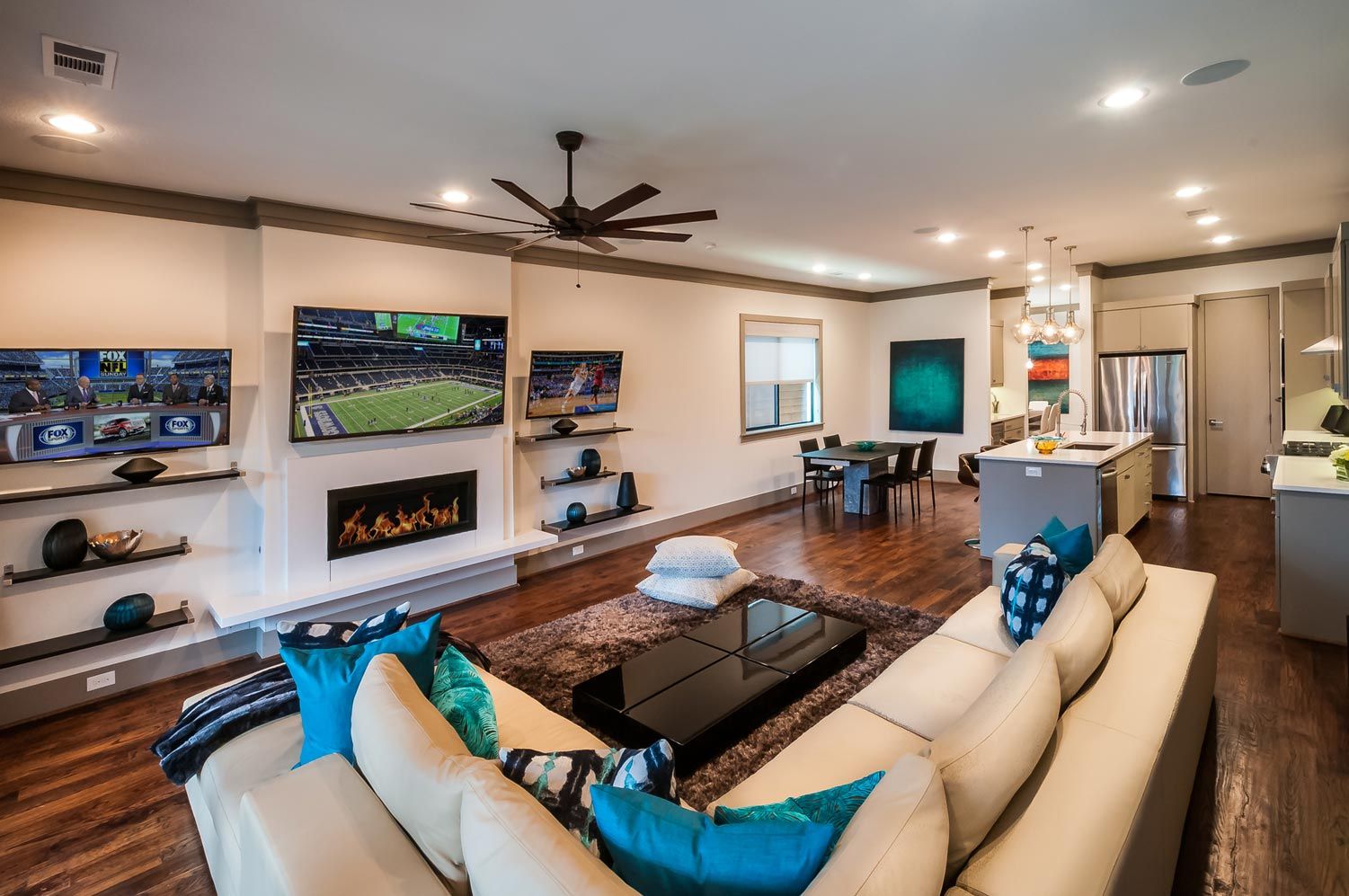
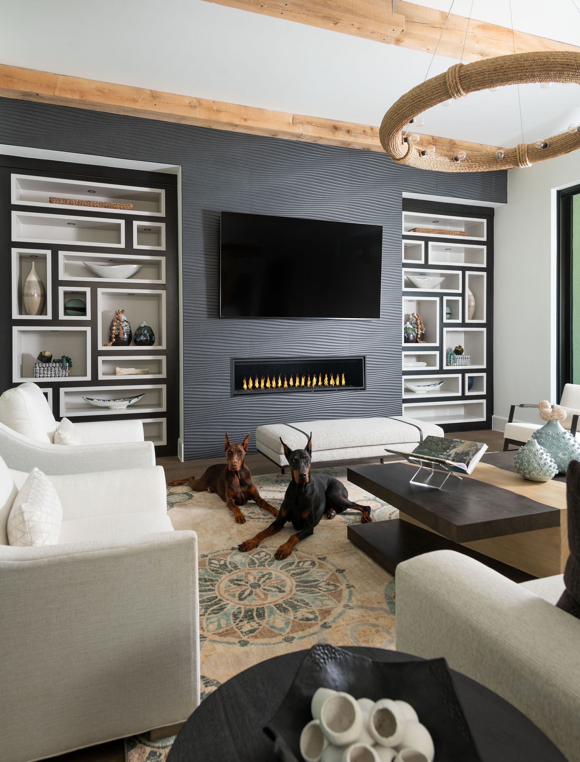
We're not suggesting a complete overhaul with bold hues everywhere, but rather a thoughtful approach. Imagine a serene living room
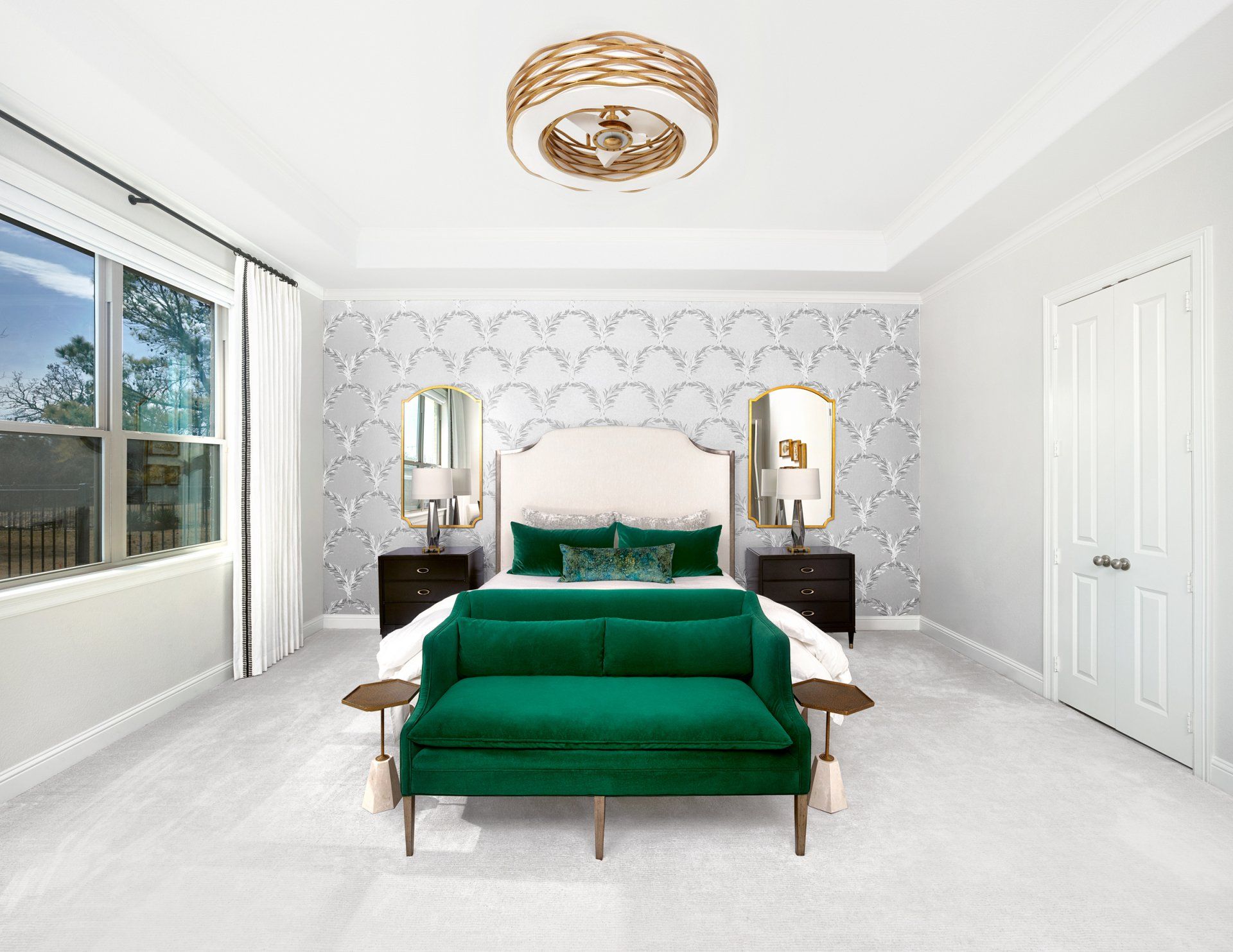
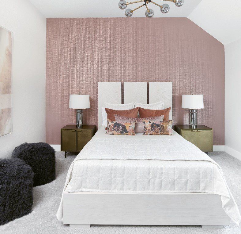
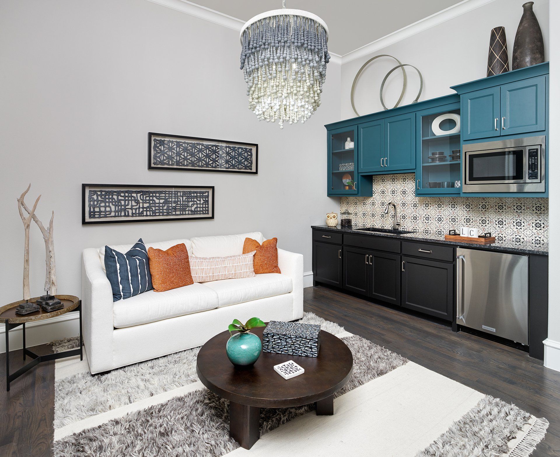
with a neutral sofa, brought to life with a few strategically placed throw pillows in a rich jewel tone. Or a minimalist bedroom with a striking piece of artwork as the focal point, injecting energy and personality.
And let's not forget the walls
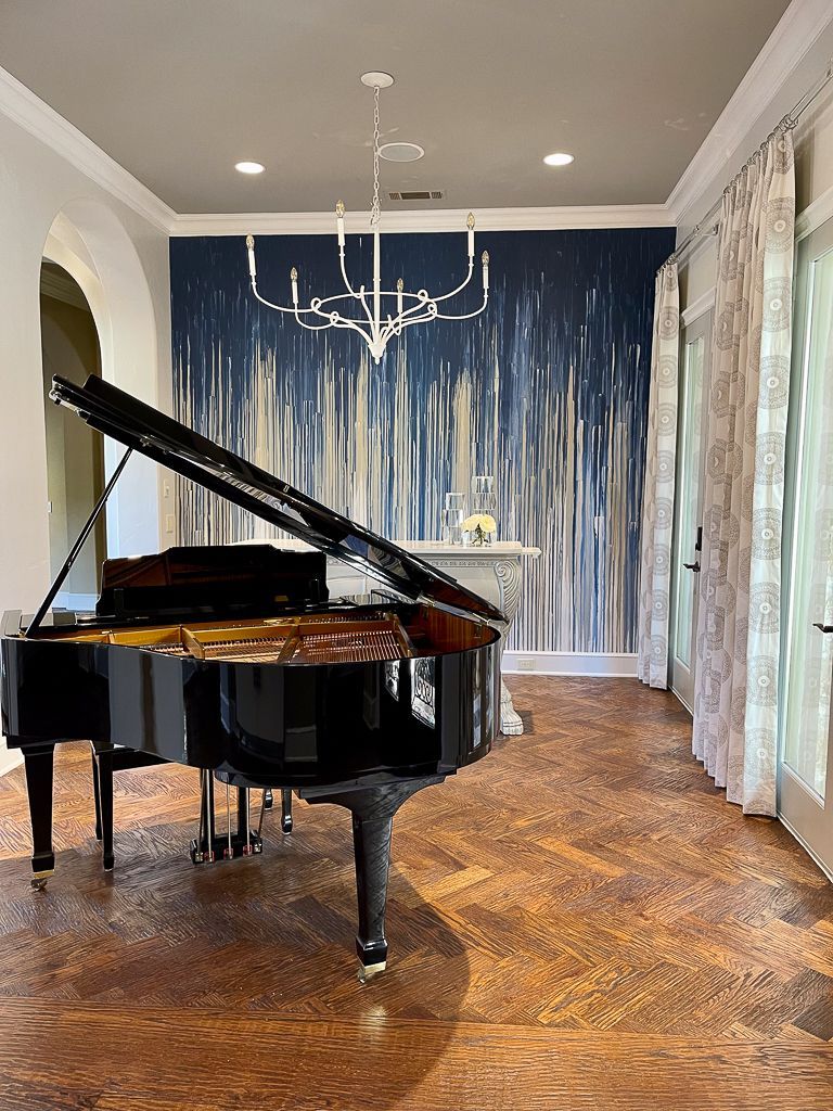
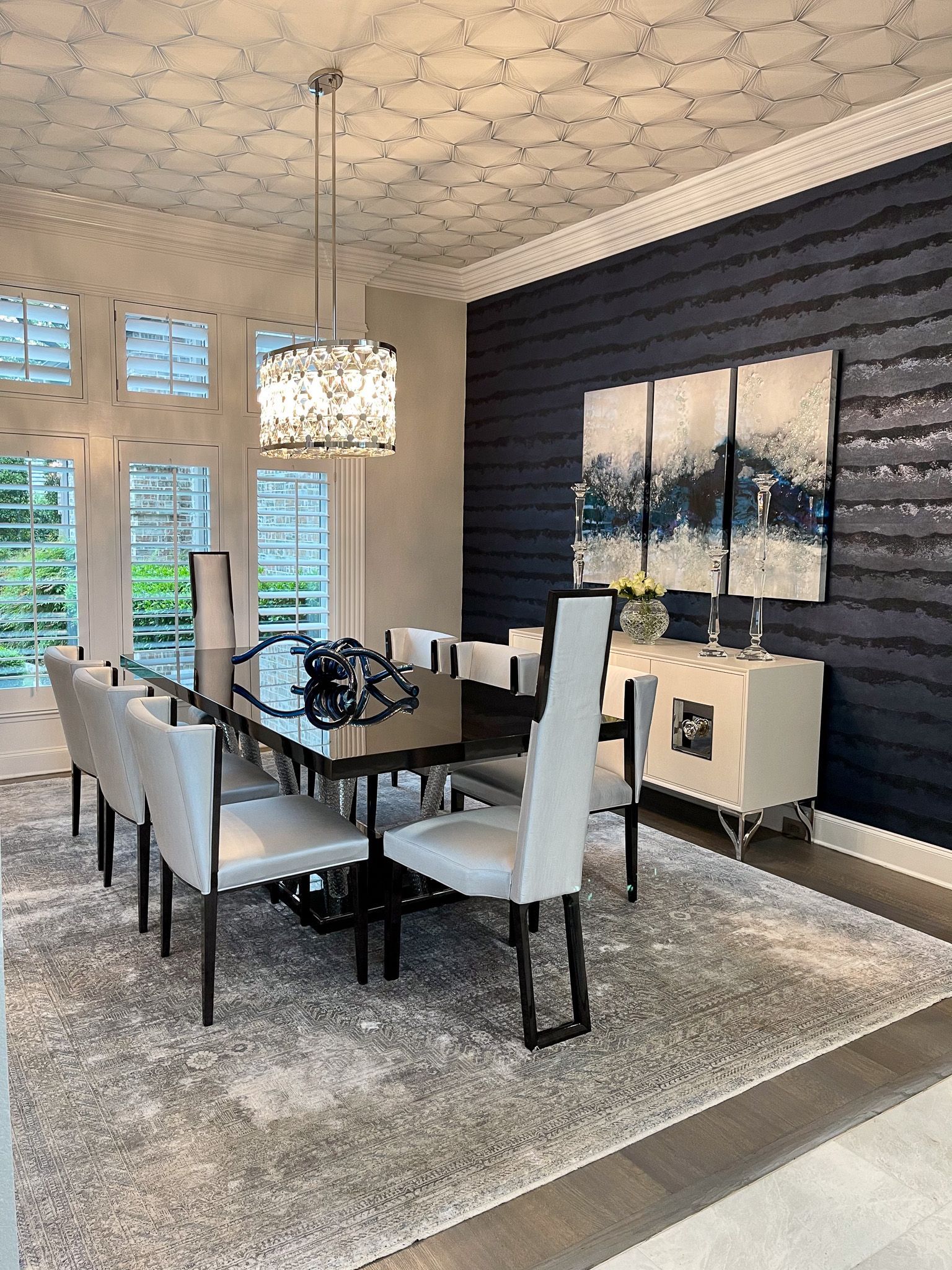
themselves! While we often think of walls as simply a backdrop, they can be the perfect canvas for your "pop" of color. Instead of an entirely neutral space, consider painting an accent wall in a bold and inviting shade. Think a deep, calming blue in a home office to foster focus, or a refreshing, vibrant green in a kitchen to create a sense of energy and connection to nature. These bolder wall colors can become a defining feature of the room, setting the tone and personality.
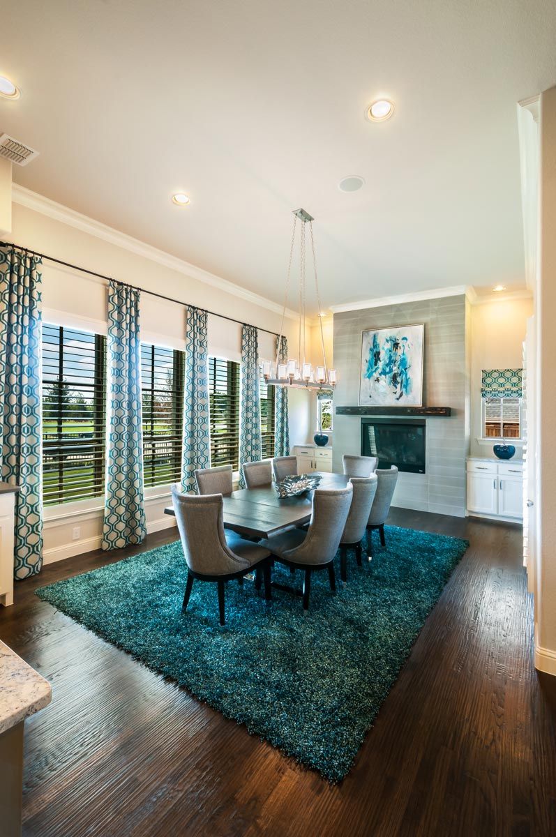
This trend for 2025 is all about balance. It's about creating a sophisticated environment that doesn't shy away from a little bit of fun. A bright accent chair
in a reading nook, a boldly colored vase on a coffee table, or even a statement rug can make a significant impact without overwhelming the space. It’s about using color intentionally to draw the eye and create a sense of intrigue.
So, are you ready to add that little extra something to your home? Let's explore some exciting color possibilities together! Visit our contact
page to discuss how we can bring your vision to life.

Share This Post
Estimated Read Time: 3-4 minutes Key Takeaways: Use layered stacks of large format books at varying heights to introduce structural depth and express your personal aesthetic. Contrast smooth surfaces with architectural, tactile objects like stone cuboids, marble bowls, or artisan ceramics. Leave intentional open space for hosting while integrating high-end interactive elements like a custom marble chess set. How to Style a Coffee Table with Intention A well styled coffee table has the power to pull an entire living space together, but knowing where to start can feel overwhelming. "How do I style my coffee table?" is one of the most common questions we hear and for good reason. As the natural centerpiece of the living room, it plays a massive role in your daily life. From anchoring a room during an evening of hosting to serving as a functional landing place for books, candles, and cocktails, it is easily one of the hardest working pieces of furniture in the home. When approaching your layout, the first things to consider are shape, scale, and proportion. Whether your table is a sleek rectangular stone block, an oversized square, or a minimalist round design, your styling choices should enhance the flow of the room while showcasing your personal narrative. To help you elevate your space, we’re breaking down three of our favorite design approaches to transform a simple surface into a beautifully curated, layered focal point. How do you choose the right dining chairs, when should you mix and match seating, and how can you ensure your selections fit the scale of your table? Whether your home features an open floor plan or a more defined dining area, here are four practical strategies for mixing and matching dining seating to create a space that feels unified, inviting, and timeless. 3 Approaches to a Beautifully Curated Surface Stacking with Scale Using books as the structural foundation of your coffee table is a classic, timeless styling technique. Books add instant warmth, but they also serve a deeper purpose in high-end design: they introduce height, structure, and a distinct sense of personality. Instead of a single book, try creating two to three clean stacks of varying heights to build visual interest across the surface. The subjects you choose whether focused on travel, architecture, fashion, or fine art communicate a great deal about the people who inhabit the home. Beyond their aesthetic value, stacks of large format books provide the perfect elevated platform to layer in smaller decorative elements, like a simple catch all marble bowl or a clean, scented candle. Incorporating Form and Texture To keep a modern or transitional living space from feeling flat, your coffee table needs a high touch, tactile moment. This approach focuses on incorporating unique decorative objects that invite the eye and the hand to explore. Think about contrasting the smooth surface of your table with pieces that offer physical depth and material honesty. A heavy, hand-honed stone cuboid, a sculptural marble object, or a sleek glass box can act as beautiful, artistic anchors. You can also introduce organic texture with a minimalist ceramic vase holding simple greenery or pampas grass. The goal is to select items that have an architectural quality, transforming your table into a mini-gallery of curated treasures. Designing for Engagement For homes that prioritize entertainment and hospitality, the coffee table should function as a natural invitation for guests to linger and interact. This layout is all about blending upscale design with low-stimulus, engaging elements that turn the room into a sophisticated lounge. Consider incorporating beautifully crafted, high end versions of classic pastimes directly into the landscape such as a heavy wood or marble chess set, or a designer deck of cards in a sleek leather case. When styled alongside ample open space for guests to set down a drink, this approach strikes the perfect balance between refined luxury and a welcoming, lived in atmosphere.
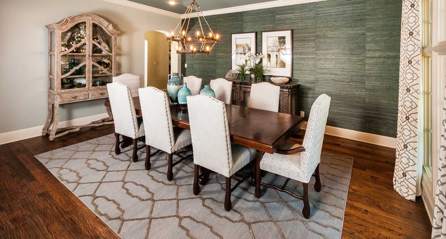
Estimated Read Time: 3-4 minutes Key Takeaways: Avoid a uniform showroom look by mixing chair tones and textures against the finish of your dining table. Pair substantial, fully upholstered end chairs with streamlined side chairs to eliminate a clattering "forest of legs." Reserve mixed seating arrangements for rectangular or oval tables, keeping circular tables uniform to protect symmetry. How to Build a Curated Dining Space with Intention Your dining area shouldn’t feel like a sterile showroom, mixing chair styles can turn it into a space that’s both cohesive and full of personality. Creating a beautiful and functional gathering area comes down to choosing the right chair combination. Because the dining room is one of the most high traffic spaces for hosting and family life, finding seating that complements your style and fits your layout is essential. How do you choose the right dining chairs, when should you mix and match seating, and how can you ensure your selections fit the scale of your table? Whether your home features an open floor plan or a more defined dining area, here are four practical strategies for mixing and matching dining seating to create a space that feels unified, inviting, and timeless. 4 Strategies for a Curated Dining Space Balance Tones and Materials The easiest way to establish visual balance is by looking at how the chairs interact with the finish of the table itself. If you have a solid wood table, avoid using matching wood chairs. Instead, introduce a strong contrast to let the pieces stand alone. For example, pairing a rich wood grain table with leather or textured fabric side chairs creates a sophisticated, layered look. If you want to mix chair styles, a foolproof approach is to use solid upholstered chairs exclusively for the ends of the table (the captain's chairs). This grounds the setup, provides a clear visual anchor, and gives the eye a nice break from repetitive lines. Contrast Weight and Shape When mixing seating, pay close attention to the structural weight and the legs of the chairs. If your end chairs are fully upholstered and have a more substantial, chunky silhouette, keep the side chairs simple, thin, and streamlined. You want to avoid a "forest of legs" where every single piece is competing for attention. If your side chairs feature slender metal or wood legs, pairing them with a clean, slipcovered or fully upholstered end chair with a hidden frame eliminates visual clutter. Always pick an end chair with more substantial weight when mixing it with slender side chairs so the arrangement feels intentional, not random. Factor in the Surrounding Space Your seating choices shouldn't be made in a vacuum; the architecture and layout of the room should dictate your decisions. In an Open Concept: You must look at the kitchen and dining areas as one continuous landscape. If your kitchen counter stools are visible from the dining table, they need to speak to each other. If your counter stools are natural wood, consider introducing iron, black metal, or fabric seating in the dining room to create a sophisticated, connected flow without matching exactly. In Smaller Spaces: Be cautious with how many different materials you introduce. Stick to a tight palette—like a wood table paired with matte black side chairs and a clean matching bench. Incorporating a streamlined bench is a fantastic, minimalist solution for tighter spaces, offering flexible seating for larger gatherings while keeping the sightlines open. Let Table Shape Dictate the Style The shape of your dining table is the ultimate blueprint for your seating layout. As a general rule, circular or round tables call for a continuous, uniform look. Mixing chair styles around a round table can quickly feel chaotic and disrupt the room's symmetry. Mixed and matched seating works beautifully on rectangular or oval tables, which naturally leave room for switching up the side and end chairs. To achieve a classic meets modern vibe, pair simple side chairs without arms alongside commanding end chairs with arms. If you want to refresh your existing space without a complete overhaul, simply swapping out your two end chairs for something texturally distinct can instantly breathe new life into the entire room.
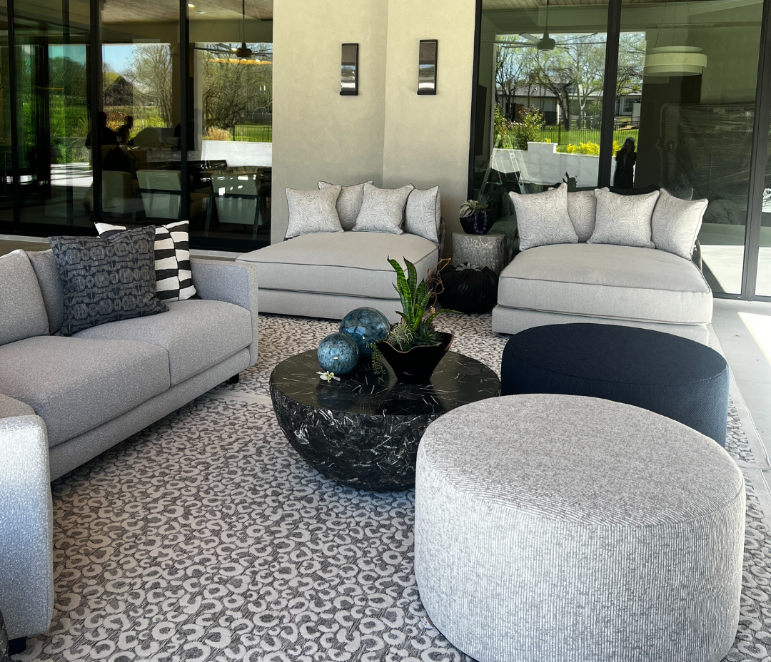
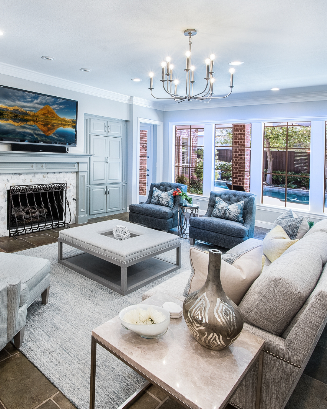
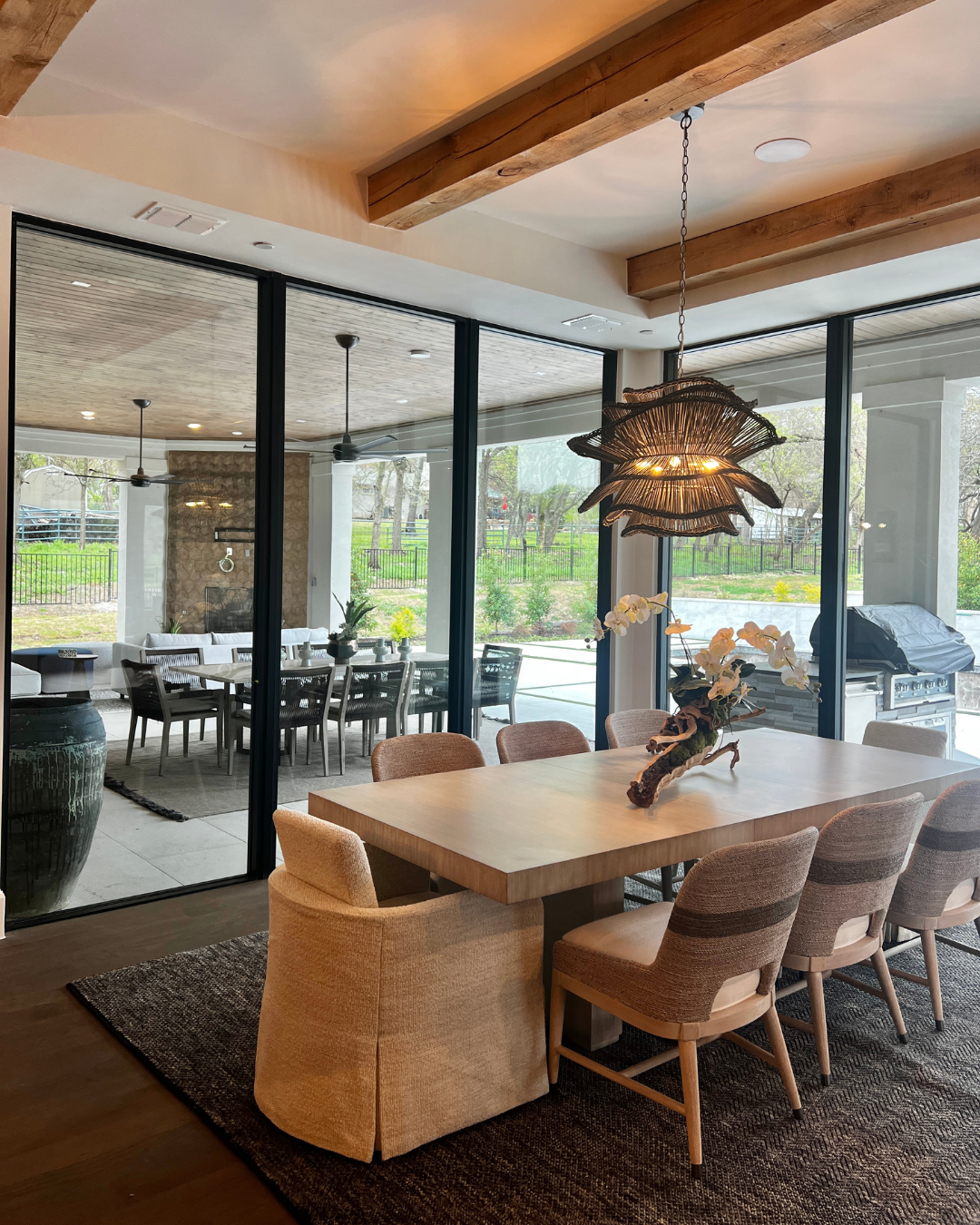
Estimated Read Time: 3-4 minutes Key Takeaways: Transition to Light Linens to add movement and breeziness to your indoor-outdoor flow. Focus on Expanding the Architectural Horizon by blurring the lines between your lounge and your patio. Use Atmospheric Engineering to manage the increased natural light and keep your home a cool, restorative retreat. Transitioning Your Home for the Warmer Months As the Texas sun begins to intensify, your home should transition from a cozy winter retreat into a breezy, Summer Sanctuary. At Stephanie Kratz Interiors, we believe in "Seasonal Fluidity" the ability of your home to adapt its Atmospheric Engineering to the time of year. Transitioning for summer isn’t about redecorating; it’s about shifting the Tactile Integrity of your space to reflect the light, energy, and openness of the season. 3 Essentials for a Restorative Summer Home The Breezy Fifth Wall As we head into May and June, we swap heavy velvets for light, Belgian linens. This is about Expanding the Architectural Horizon; lighter fabrics catch the summer breeze and move with the air, adding a sense of "Organic Modernism" to your windows. Light filtering sheers allow you to maintain privacy while letting in that soft, minimally stimulating summer glow. Blurring the Social Sanctuary Lines In the summer, your patio should feel like a direct extension of your living room. We focus on Spatial Integrity, ensuring the furniture layouts and "Visual Anchors" outdoors mirror the sophistication of the indoors. By using performance fabrics with "High-Touch" textures, your outdoor lounge becomes a seamless part of your home’s Personal Narrative. Cooling the Sensory Palette Summer design is about Sensory Engineering to keep the mind cool. We look for "Material Honesty" in cooler tones think matte whites, soft grays, and natural stone surfaces. By reducing visual clutter and emphasizing "Intentional White Space," you create a low stimulus environment that feels like a cold glass of water on a hot day.