By Stephanie Kratz
•
June 10, 2026
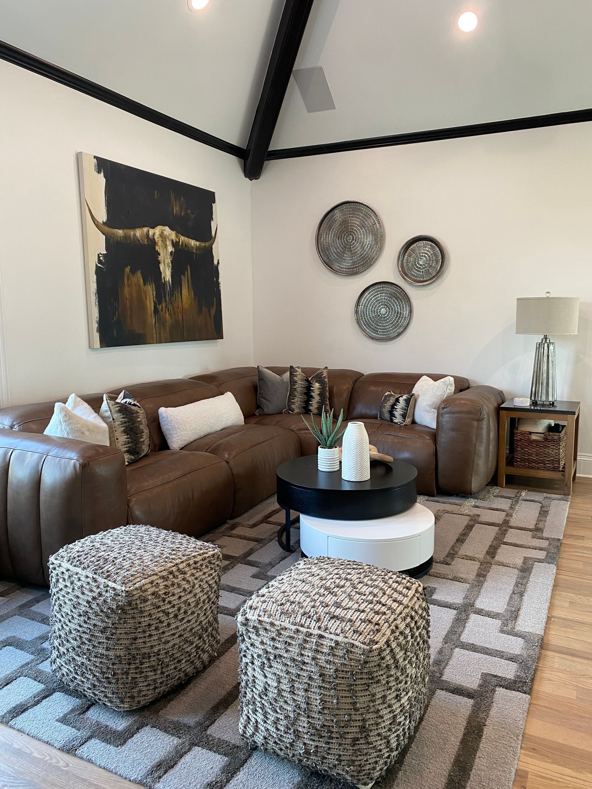
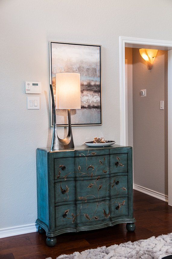
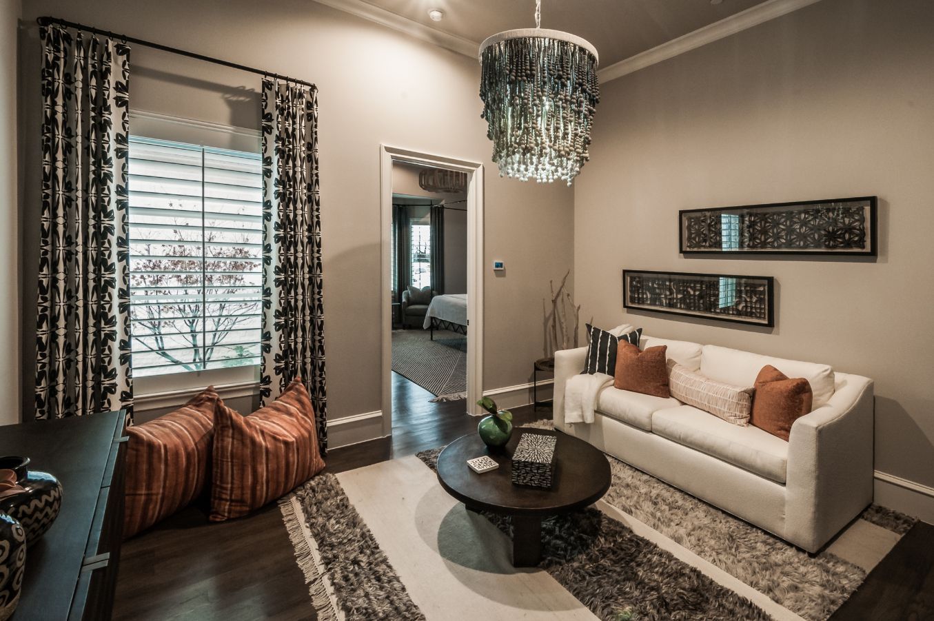
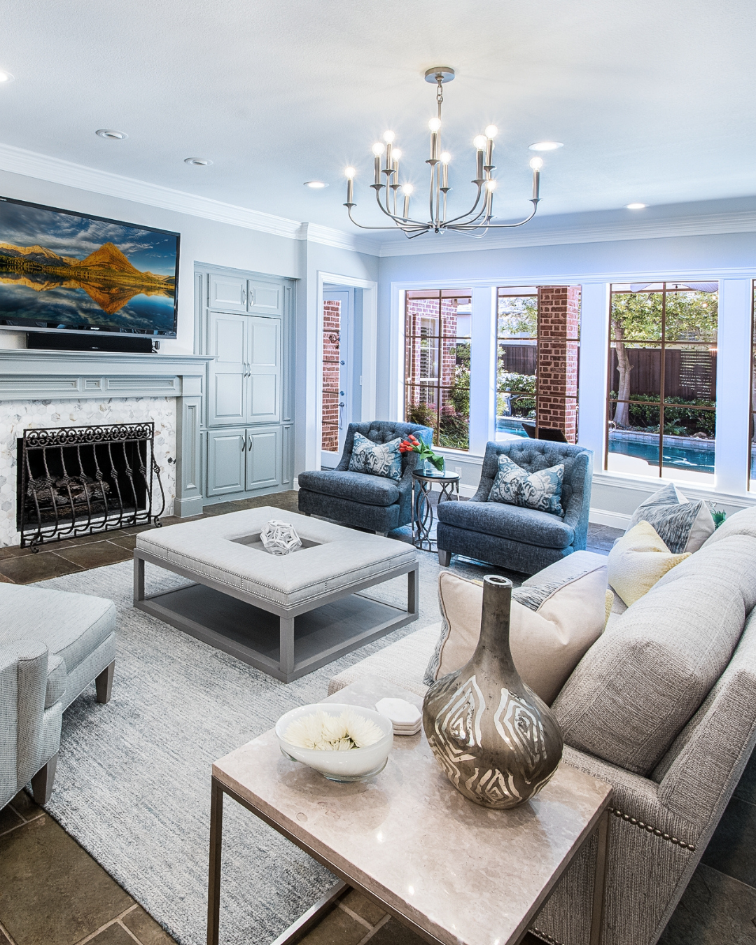
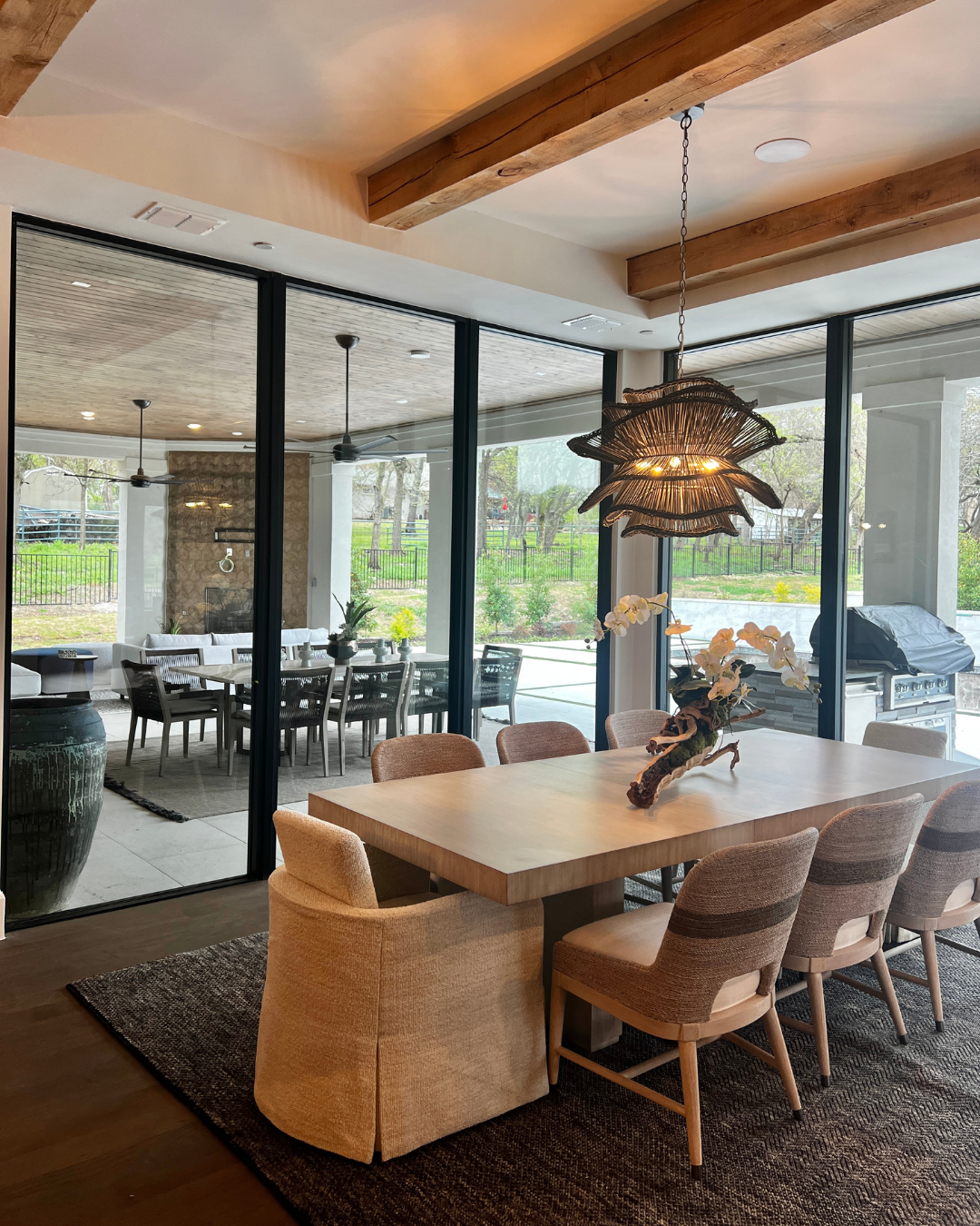
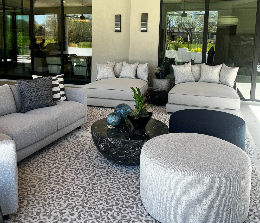
Estimated Read Time: 3-4 minutes Key Takeaways: Use layered stacks of large format books at varying heights to introduce structural depth and express your personal aesthetic. Contrast smooth surfaces with architectural, tactile objects like stone cuboids, marble bowls, or artisan ceramics. Leave intentional open space for hosting while integrating high-end interactive elements like a custom marble chess set. How to Style a Coffee Table with Intention A well styled coffee table has the power to pull an entire living space together, but knowing where to start can feel overwhelming. "How do I style my coffee table?" is one of the most common questions we hear and for good reason. As the natural centerpiece of the living room, it plays a massive role in your daily life. From anchoring a room during an evening of hosting to serving as a functional landing place for books, candles, and cocktails, it is easily one of the hardest working pieces of furniture in the home. When approaching your layout, the first things to consider are shape, scale, and proportion. Whether your table is a sleek rectangular stone block, an oversized square, or a minimalist round design, your styling choices should enhance the flow of the room while showcasing your personal narrative. To help you elevate your space, we’re breaking down three of our favorite design approaches to transform a simple surface into a beautifully curated, layered focal point. How do you choose the right dining chairs, when should you mix and match seating, and how can you ensure your selections fit the scale of your table? Whether your home features an open floor plan or a more defined dining area, here are four practical strategies for mixing and matching dining seating to create a space that feels unified, inviting, and timeless. 3 Approaches to a Beautifully Curated Surface Stacking with Scale Using books as the structural foundation of your coffee table is a classic, timeless styling technique. Books add instant warmth, but they also serve a deeper purpose in high-end design: they introduce height, structure, and a distinct sense of personality. Instead of a single book, try creating two to three clean stacks of varying heights to build visual interest across the surface. The subjects you choose whether focused on travel, architecture, fashion, or fine art communicate a great deal about the people who inhabit the home. Beyond their aesthetic value, stacks of large format books provide the perfect elevated platform to layer in smaller decorative elements, like a simple catch all marble bowl or a clean, scented candle. Incorporating Form and Texture To keep a modern or transitional living space from feeling flat, your coffee table needs a high touch, tactile moment. This approach focuses on incorporating unique decorative objects that invite the eye and the hand to explore. Think about contrasting the smooth surface of your table with pieces that offer physical depth and material honesty. A heavy, hand-honed stone cuboid, a sculptural marble object, or a sleek glass box can act as beautiful, artistic anchors. You can also introduce organic texture with a minimalist ceramic vase holding simple greenery or pampas grass. The goal is to select items that have an architectural quality, transforming your table into a mini-gallery of curated treasures. Designing for Engagement For homes that prioritize entertainment and hospitality, the coffee table should function as a natural invitation for guests to linger and interact. This layout is all about blending upscale design with low-stimulus, engaging elements that turn the room into a sophisticated lounge. Consider incorporating beautifully crafted, high end versions of classic pastimes directly into the landscape such as a heavy wood or marble chess set, or a designer deck of cards in a sleek leather case. When styled alongside ample open space for guests to set down a drink, this approach strikes the perfect balance between refined luxury and a welcoming, lived in atmosphere.